Pages

    Showing posts with label modern. Show all posts
    Showing posts with label modern. Show all posts

    Tuesday, August 3, 2010

    New moderns

    Just a hat tip to all the folks in our area doing new modern projects -- it's great to see a swell of infill modern homes. Grassroots Modern is keeping tabs on a few, including the one we drive past every day: ul[1] on 900 East around 700 South.

    We like the lines, suspect the architect is the son of a former neighbor in our original slc202 condo building by the University of Utah, and love the privacy walls in the outdoor spaces (can you tell we still haven't built our fence yet?).


    But this was our favorite:

    "We had been looking for a lot in the up and coming neighborhood of the Salt Lake 9th and 9th area for a period of 3 years. This area is extremely competitive for vacant land and building small modern homes is beginning to be the trend. This has been going on in other metropolitan areas for years but we are seeing an increasing demand for this type of product in SLC for which there is few to choose from. I believe we are raising the standard for this building type in the area and am very excited to see it being constructed." (emphasis mine)

    We also loved this gem (in a non-sarcastic sense):

    "The house achieved Gold LEED standards but the owner opted for spending the additional 5-6 thousand in other areas instead of the LEED testing and registration fees."

    Amen.

    Tuesday, September 15, 2009

    Elevations

    It occurs to me that many people reading this blog (are there many?) are seeing the building coming out of the ground without any idea of what it is designed to look like. In the beginning this was deliberate and then I guess I just got lazy. Since our house is quite modern and permitting was stressful and painful enough on its own, we wanted to avoid the possibility of someone trying to slow down the process for us at the city because they didn't like our design. We were actually very careful to design the house completely within the zoning requirements without any variances. This was to avoid giving anyone else any input into the design of our house. Though it would have been nice to try to get some extra height, we have seen too many examples of modern home designs seeking variances get squashed by neighbors who would seem to think a nuclear waste facility was being put in next to them.

    With permit in hand and building well under way, we now unveil the elevations of our home.
    East Elevation

    South Elevation
    West Elevation


    North Elevation

    I colored these myself, so the colors aren't probably very representative of what it will actually be but the silver sections are two different profiles of 12" wide galvalume siding. The light brown areas are horizontal cedar 6" tongue and groove siding and the areas that are a darker brown are bronze window and door cladding and matching metal panels.

    We really love the design that Kenner and Matt came up with for us and we really love watching the Davido bring it out of the ground and make it a reality.

    Tuesday, September 1, 2009

    11 views on YouTube = famous!

    We mentioned on Twitter recently that we had a visit from Park City TV to take a look at our current condo. We are clearly not TV stars, but we still get a kick out of seeing the finished product (and that remixed Jose Gonzalez song as the soundtrack!):


    (Plus, how classic is it that Tai's first reaction was, "the SWINYARD condo??!?" Totally makes up for all those times I've been called a Biesinger, darling!)

    Tuesday, May 5, 2009

    Priorities

    Yes, that's our Eames lounge chair showing up in the elevations. The first — and, to date, only — piece of furniture included in our elevations. We are those people.


    (Sorry for the horrible photo quality.)

    Thursday, March 26, 2009

    Meet the architects

    Introducing our architects: Kenner Kingston (left) and Matt Nelson of Architectural Nexus.


    We're thrilled to be working with Kenner and Matt, who caught our eye for Architectural Nexus' work on the Lucy Avenue house (those owners were guest bloggers on Grassroots Modern during their building process, here, here, and here). Arch Nexus is large firm with offices here, Logan and Tempe, Ariz., and they've done a lot of institutional, medical and commercial work. Kenner, a LEED-accredited partner, worked on the eye-catching University of Utah Orthopaedic Hospital in Research Park.

    This is a much smaller project than this firm would normally take on, so we're grateful that they are committed enough to the idea of a small, modern house in Salt Lake to spend their Thursday nights with us. (Also, big thanks to their understanding families for loaning them out on the night of the week's best TV.)

    We spent Thursday evening going over the basics of how to layout our home (I can say that! We're really building it now!!). It was a really fun evening, spent answering questions such as, "How do you feel about doors?", "Does the kitchen need to be part of entertaining?", and "What do you expect out of your outdoor space?" It was great to be part of a guided discussion about the priorities for our home. At the end of the night, Kenner and Matt had sketched out a basic layout for the two floors.

    Next Thursday we'll take a look at a few basic designs, or massings (arch-speak for 3d renderings).

    Friday, March 20, 2009

    It's a go

    Things have fallen into place this week in ways that we could never have imagined. More details soon!

    Tuesday, March 17, 2009

    The land down under

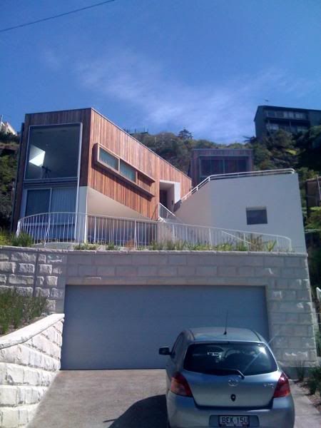
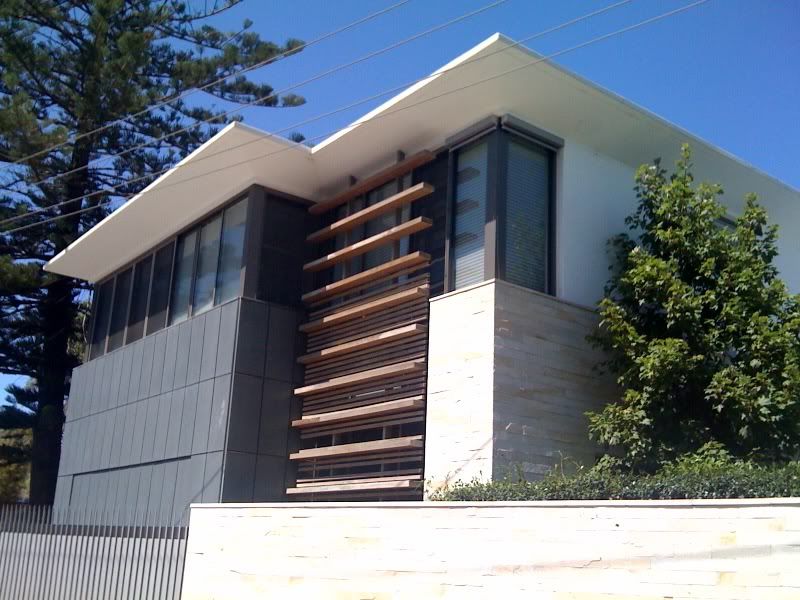
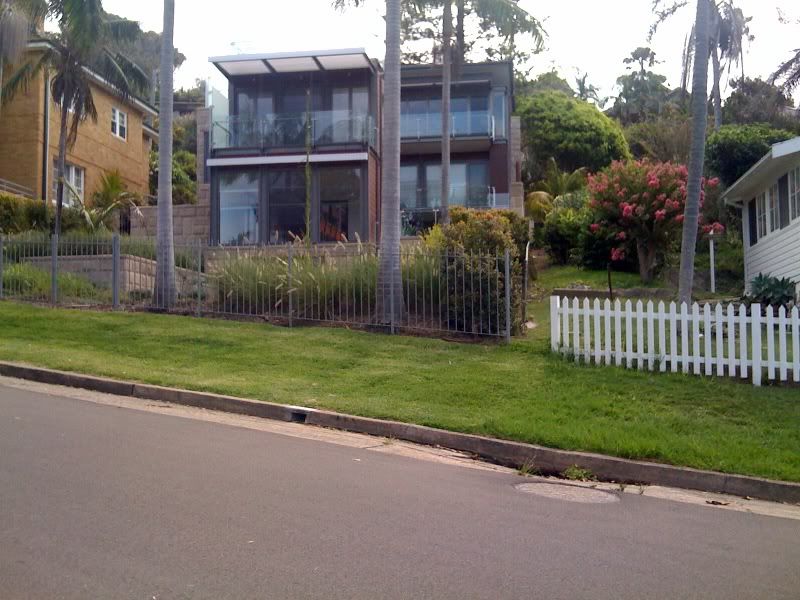
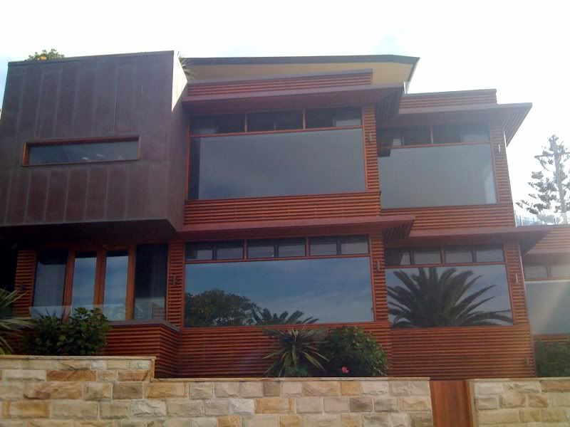
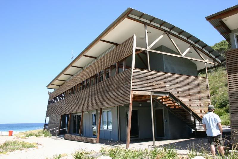
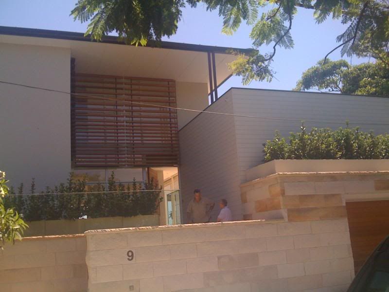
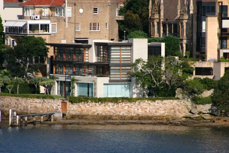
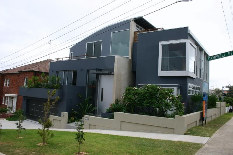
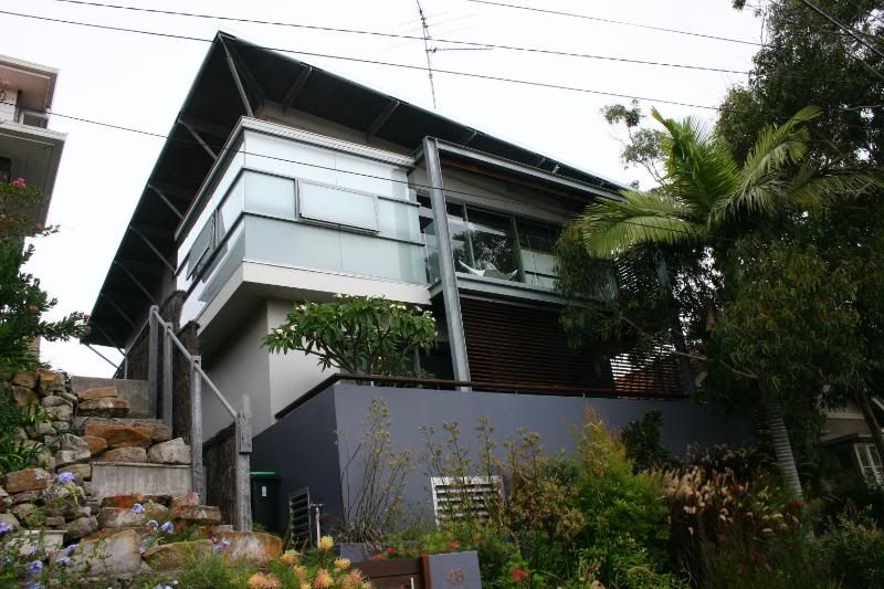
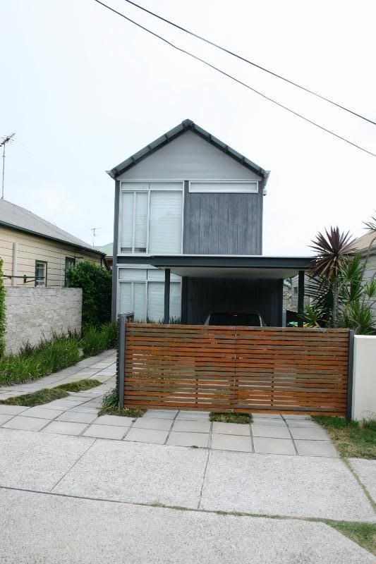
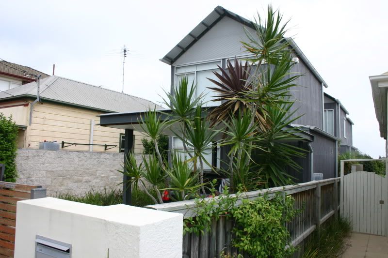
    We're back from Australia and basking in the memories of that very cool place. Friendly people, amazing beaches, beautiful city, and lots of modern homes. We didn't do any tours or seek out houses that fit our aesthetic down there. But the thing about Sydney is that modern architecture is everywhere -- it certainly seemed to be a more accepted and desirable style than in Salt Lake City (understatement? check!).

    These houses are a few that we ran across while looking for other things. They aren't necessarily the best examples of the work down there (Dwell thinks that it has those covered in its March issue), nor are they necessarily exactly what works for us, especially in this climate. But, wow, aren't they cool?

    Photobucket

    Photobucket

    Photobucket

    Photobucket

    This one was a public building at a beach in a national park about a half-hour south of Sydney:
    Photobucket

    This one backed onto a beach just north of Sydney. While we were enjoying the beach, a professional photography crew came to get styled shots of the interiors and rear of the house.
    Photobucket

    This was right across the bay from where we were staying (Thanks, telephoto!):
    Photobucket

    Photobucket

    This one had gorgeous landscaping:
    Photobucket

    And this is how a pitched-roof can look cool:
    Photobucket
    Photobucket

    Sigh.

    Thursday, February 12, 2009

    Early kitchen sketches

    Here are a few sketches Tai did of a kitchen layout:


    He drew these using Ikea dimensions and products — we have an Ikea kitchen now and are pretty pleased with the way it came together. Pleased enough, actually, that we're planning on using their cabinetry and few of their details again.

    We're still working on those contract details and trying to get as much information about the lot as possible before we go to Australia. (So, yes, we're stalling on the posting!)

    Tuesday, February 10, 2009

    The Monocle House

    This is what has affectionately come to be known as The Monocle House:


    It still has the dogtrot style with the home office hanging off the back:
    You can't really deny it, can you?

    Monday, February 9, 2009

    Dogtrot style

    We really enjoy entertaining and bemoan our lack of deck and yard every year when spring comes around. That grousing and this house:


    is what led Tai to play around with a dogtrot style. We're not totally sure that this will work in Utah, but it's been a really fun concept to consider.

    If we pursued this type of design, we would probably put a home office in the back portion of the first floor, to separate it a bit from the rest of the house.

    Friday, February 6, 2009

    Early skteches

    Time for some pictures.

    These are some illustrations that Tai has played around with in SketchUp. (This is also how he spent the considerable time alone while I was working nasty hours at Body Worlds.)

    The lot is long and narrow and oriented east-west, giving us great southern exposure. The narrow width of the lot has been the deciding factor in the designs, and the width likely would also limit flexibility in the interior floor plans.

    Here are some early sketches, playing with the lines:


    Here's a bit of color:


    We'll put up a few more in the coming days.

    Saturday, May 24, 2008

    Decision

    It's been a while since we've updated. Sadly, the silence is mostly an indication of us not doing much on the home front. We've been insanely busy with work, but occasionally we have a moment to ponder how little we want to stay in this current condo long term!

    With that in mind, we've made a bit of a decision. We're no longer eyeing lots in any type of historic preservation district, which includes our current neighborhood. It hit me one afternoon that I didn't want a board of strangers telling us what we could or could not do with a particular piece of property.* There are fewer things that make me grumpier faster than thinking about the Historic Landmarks Commission.

    * And yes, I know that this grouchy libertarian rant doesn't take into account all the good things that zoning has brought this world, nor the positive achievements of cities — and Salt Lake City, in particular — such as the roads I drive, the power lines I use, the water lines that slake my thirst, et cetera, et cetera.

    That's the short story.

    The medium story is that I called a SLC planning employee to ask about a particular, reasonably-priced property in our neighborhood. This piece of property has a nearly condemned home on it, making it — so I thought — a ripe candidate for a tear-down. The planner stated in no uncertain terms that she would never try to tear down a building in a historic preservation district. She almost laughed when I pointed out that the building wasn't a contributing structure, that it was in really bad shape, hadn't been occupied, was nearing the point when you can call the city to request that it board up the home, etc. Evidently, even the planners in the city recognize that the HLC doesn't play that way.

    The HLC has absolute power over tear-downs in historic preservation districts. In order to tear down anything in that district, you must prove economic hardship, which is a subjective term with jurisdiction for that decision residing solely with the HLC. In short, the HLC does not want you to tear down anything in a preservation district.

    With the rest of what we've heard about the HLC, the variances that they would have to approve in order for us to build on any lot in this area, and the grumpiness I feel about these guys in general, something clicked. I just didn't want to deal with it any more. I didn't want to have to pep talk myself into the fight it would take to build modern in this area. I love this neighborhood, but...my love has its limits.

    So, wherever you are, nameless planner in the depths of the City-County building, this post goes out to you. Thanks for setting me right. We're now looking at neighborhoods near Liberty Park, just south of downtown, safely outside Salt Lake's historic preservation zones and near a couple of streets where a few other modern homes have popped up in the last year or so.

    Oh, and I promise to hound Tai to show you all what he's done with the fireplace, book shelf, and mantle.

    Saturday, March 15, 2008

    CaBOOM!! Day 1

    My christmas present last year from Kersten was a trip to the CaBoom Design Show in Santa Monica. It's a trade show for modern design products and in addition to the trade show there are tours of modern homes in the LA area where the architect and owners give tours of the homes. There is a tour on Friday, Saturday and Sunday and Kersten got me tickets to all three days.

    Getting to LA and making it to the first tour was an adventure in and of itself but I did finally make it here in time to tour the homes in the Pacific Palisades. We toured 5 homes and while they were all really cool, these 3 were my favorites.

    I really liked the warmth of the wood and plaster on this house. The inside had really great earth tones and earthy materials. The roof was a really cool interpretation of a butter-fly roof with a skylight in the middle over the stairway where the roof planes meet. Designed by Gray Matter Architecture.

    Inside the ceiling lines are skewed at odd angles, which according to the architect did something to the perspective when looking at the house from different angles.


    I really liked the window for a backsplash in the kitchen here.

    This is the steel stairway with the skylight above it. It was really great to have so much natural light flooding into the space.


    These are a few of the details that really stood out to me.
    I love this big front door that hinges off center.


    The doors and casings were all bamboo, which I had never seen before, but you know how I love bamboo. It looked really cool.


    This detailing for the base boards is called a shadow mold. I thought it looked really cool.

    House 2
    This was my second favorite house designed and built by Built, Inc.


    House 3

    This house was really much less traditional than the others. It breaks free of right angles and has really creative use of texture and materals. It was designed by and built foran architect from Kanner Architects.

    You can see the really interesting trowel work on the stucco that I really liked.


    This cat represents what I really like about cats. They are tough. It just sat there and stared at everyone who walked in, making it clear that this was his house.


    I also love how it stands in contrast to and defiance of the really inauthentic new building directly across the street.