Pages

    Thursday, February 9, 2012

    Powder room

    As I've mentioned, our first floor is very open. The living room, dining area, and kitchen all bleed together. It's great for entertaining — there is tons of space for people to hang out, and if we're keeping an eye on the stove during a party we're never really out of the action. We love it.

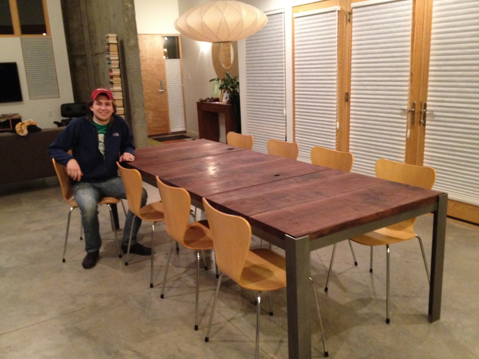
    However, it is tough to figure out how to fill the space. I worry about strong statements in one part of the first floor that may clash or not carry over to the rest of it. As a result, we've been very conservative about adding pieces and statements to the first floor, and we tend to play it safe with a neutral couch or a fail-proof dining table.

    But it's the dead of winter, people, and dammit, I want some color. And I want it cheap. Enter: Hot Lips.

    Our powder room is its own little space, and it was sorely in need of some attention. It had one blue wall (our fav, colonial blue), a couple of afterthought photos on the wall (one of which had no glass in the frame because we are high class), and a junky wastebasket that left scratches on the wall.

    No longer.

    In progress:


    Tai ceded this one to me, and I ran with it. The trick, Hot Lips lovers, is to make it so inconvenient to move the bathroom fixtures in and out that once it's done your husband's abhorrence of the color doesn't compare to the hassle of taking apart a sink and toilet.

    I, on the other hand, genuinely love the color and selected it above other equally questionable options.


    The camera phone doesn't really know what to make of it, though, as you can tell by the near-red to deep-magenta depictions here. And maybe my eyeballs don't know what to make of it either. While I was painting, I'd have to come out of the room every few minutes and blink hard for a while before I could see straight.

    My favorite thing, though, is the combination of the pink against the blue, along with this Todd Chilton painting we have in that area. I think the jewel-tone pink fits perfectly with the grays and the blues.


    My second favorite thing about this, though, is the story the paint store guy told me as he was mixing my quart. One of the store's clients, a "gentleman's club from somewhere along State Street, I think" came in and requested a few gallons of Hot Lips. The club owner painted the outside of his "establishment" in Hot Lips because "you know, it was, um, a gentleman's club. Then, the city came through and made them repaint in gray and black three days later."

    Hot Lips is so hot that even a strip club isn't allowed to use it. I'm proud it found a home in our powder room.

    Wednesday, February 8, 2012

    Master suite paint

    When we painted our giant wall blue, we extended the color into the north wall of our bedroom. My thinking at the time was that it was a nice statement of unbroken blue along one whole side of the house. My thinking since then is that it's boring.

    (Sidenote: we were so out of our minds during the building process and we had to make so many snap decisions, that we might be undoing some of those last-minute picks for a few years to come. See also: kitchen, Ikea.)

    So our master bedroom had one colonial blue wall with a few hastily placed paintings. As we've lived in the house a years, the bedroom just felt kind of thrown together — no deliberate decisions or direction. I wanted something calming and neutral so that the new paint color could match whatever we decide to do with new bedroom furniture in the future. We agreed on spring flowers. This is the second-girliest color in the house, but it works in the space because it's a shifter. Depending on the light, it can look like a barely-there gray, or a deeper blue. It almost never looks violet/lavender, something we discovered after having the chip on the wall for a couple of weeks before painting.


    Eventually, we'd like to replace the bedroom set with something in a lighter shade of wood (maybe walnut-esque), and I think it will look better than our current espresso color scheme.


    I also love this style from FLOR, and am looking forward a day when we have enough disposable income to put down squares of this under a new, lighter bedroom set.


    The view from the top of the stairs:


    You can see just a teensy bit of the new color, but what's important is that the colonial blue ends at some point. It's a pretty modest change but one that feels good as the first step in reworking the bedroom.

    Our bathroom was totally white and also needed some help. Again, we had a lot of hasty decisions that added up to a thrown-together bathroom — a crappy Ikea towel rack with crappy Ikea towel hooks, a crappy Ikea TP holder, etc. I took out all of that. Tai mudded over the nasty gouges in our wall from all that Ikea shiz, and then I painted with sidewalk gray.

    Sample patch:


    Final product:

    It's barely different from the bedroom, and it's light enough to not interfere with putting on makeup or stumbling around blurry-eyed in the middle of the night. I also really like that it's neutral enough to accommodate pretty much whatever color scheme of towels/shower curtain that we come up with in the future, making change an easy prospect.

    Tuesday, February 7, 2012

    Check it

    Look at these little dudes!


    Evidence of a mild winter. I hope we don't get socked with something in March that kills off our baby lettuce.

    Sunday, February 5, 2012

    Paint

    When we renovated our two condos, our standard m.o. was to blitz the place white and add a few accent walls of color here and there. Tai had a great color palette in his first place that pre-dated me, and we generally stuck to it — a pretty yellow, a good blue, a nice red, a pleasant green, etc. When we moved from Wasatch Towers to Center Street, we basically used the same set of colors, but just shuffled the rooms around. I felt kind of lame about this, so when it was time to build the house and pick interior colors, rather than do the same thing again, we sort of just didn't do much. 

    We have a giant wall in our dining area and upstairs hallway that is a mellow shade of blue. But because our first floor is so open, we didn't really do anything else. Then, we added a new couch and a giant painting. Then, a new table came along. We filled in with a few counter stools, and all of a sudden it felt like we actually lived in the place. It's been a slow process, but it finally felt like it was time to paint. 

    We have two small bedrooms and our master bedroom upstairs; all needed some attention. The first bedroom is what is informally known as the guest room. (We have had house guests exactly twice.) I saw this photo in a recent Dwell and really loved the pop of dark blue with white all around. 


    With our light bamboo flooring upstairs, it seemed like a good inspiration. So this is the current state of the guest room:


    I wonder if all those unhung frames are what's keeping the Dwell editors from calling. Or maybe it's the exposed box spring and lack of bed comforter? So picky. (Also, I moved my husband's rifles to be out of the frame. But, Dwell, we can always put them back in for the magazine shoot.)

    Whatever. Work in progress, right? 

    As it turns out, the color I ended up using in the guest room is the darkest hue on the same palette as colonial blue — something called Hudson Bay. So waspy. I love it.

    Then, we had the issue of the other small bedroom. I have a hard time with this one. This room was always intended to be our nursery. We have now lost two babies and don't know if/when we'll be able to have a child. It's been in limbo before we even finished the house, and it has stayed that way for the last two years. For my own sanity, I needed to pick a color and move on with the room so that it wasn't a white box waiting for something.

    This room gets strong southern sun (our first choice of color — a bright orange — made the place look like a bag of Cheetos). I wanted a warm color, but had to balance that with the retinal ZOWIE factor from afternoon sun in the winter. So I went back to a tried and true yellow called morning sunshine.


    And that room is even filthier than the other one, so that's all you get to see of it until I get my act together and figure out what to do with yarn and sewing supplies. (Also, I spy the makings of yet another project there on the floor. More on that later.) Overall, though, I'm really happy with the combination of the strong indigo in the guest room and this gentle yellow in the sewing room. It feels like a nice balance on the second floor.

    Next up, bedroom and bathroom color. It's an exciting life, folks.

    Monday, January 23, 2012

    Changes

    The home improvement bug sunk its fangs into me HARD at the beginning of the year, so we have changes afoot. Here's a sneak peek:


    We've been quite busy, and I'll post some documentation soon.

    Sunday, January 8, 2012

    Tree to table

    There's nothing quite like chopping down a tree and turning it into a table. But to get to this,


    You have to do a lot of this:


    It helps if you convince a talented little brother to swap an old table for design work on the new:


    And then it's not even sad when you have to say good-bye to the table you bought just before you got married:

    We love the new table. It fits perfectly with the rest of the house and it feels like it's been here since day one. Quinn did a wonderful job for us; he considered all the other finishes, angles, and design elements in our home and designed the new table to fit with those. The colors of the wood -- mostly plum with some lighter shades of rich brown -- blend so beautifully with the finished steel. The table seats 10 comfortably and 12 in a pinch. It arrived the Wednesday before Thanksgiving, just in time to host dinner for some family members.

    Tai built the wood sections (as you can see from the slideshow), and we had the metal base fabricated by a few of Quinn's contacts from school. All told, we estimate that we spent roughly 8 to 10 percent of what it would have cost us to purchase a similar piece at retail. We now have an heirloom piece of furniture with a great story and a ton of sweat equity.

    We're still waiting for Quinn to pick a name for it. Suggestions welcome.

    Thursday, January 5, 2012

    Plants

    This past summer was year two of garden experimentation. I knew *slightly* more than I did for the summer of 2010. One of those was that squash and zukes need so much space, so this year I gave it to them. They returned the favor by producing a gazillion spaghetti squash (which store so nicely in our pantry over the winter), and more zucchini than we could bear to look at.


    I think we won't be doing zucchini next summer.

    The creeping thyme finally took off, filling in a couple of nice spots between pavers, and elsewhere our trees and grasses started to look like they belonged in the place. I got some onions and shallots for the first time, which was also fun:


    We still have no idea what to do with tomato plants, though; ours grew up then out then fell over and killed the grass. I planted a currant variety, a cherry roma variety and a Cherokee purple. The currant produced the least but was my favorite. Tomato candy:


    Not sure if/where we'll put tomatoes next summer. They are a bit too robust for our garden boxes and we haven't really cultivated the other parts of the yard. Whatever.


    And I'll be planting the carrots in a deeper box this spring.


    The real fun, as usual, was out front in the two long skinny spaces that frame the walk to our front door. Last year, I had a sugar pie pumpkin and a Cinderella pumpkin on either side. This year I planted a melon variety (and can't remember the specific name) and a moon-and-stars watermelon. As much as growing plants can be entertaining, these two certainly were.

    The melon produced the sweetest, most fragrant fruit we've ever had. We shared it with work friends, relatives and neighbors before we finally got tired of it and lost out on harvesting a few melons in time. (At a certain point that heady-sweet smell starts to get a bit cloying and a little less appetizing.)


    But the watermelon was so, so awesome. We got four edible fruits out of it, ranging from about 20 pounds up to 41 pounds each. And it tasted a-m-a-z-i-n-g. Here's the watermelon in the works in late August:


    And here it is a few weeks later on its way to a family party:


    The watermelon butcher of Lincoln Street:


    Our only complaint here is that we didn't get as many individual fruits as we would have liked. I think I'll try for a smaller variety next year in the same spot so that we get more fruits (easier to share with people) and sooner in the season -- I was still waiting for watermelon to ripen at Halloween.

    Landscaping-wise, the scrub oak trees in the front yard appear to be dying off one by one. We had to pull one this summer and another one looked dead at the end of the fall. We figure that we'll have to replace those with something else this spring -- I'm really liking blue atlas cedar trees, but I'm worried they'll get too big for the space. I also want to add a few more feather reed grasses in the front parking strips for symmetry, and I'd love to see whether I can get a pumpkin vine to grow in the space under our street tree (which just got hacked, ahem -- severely trimmed, by a municipal arborist crew).